Responsive Website Design Company
Nowadays, the use of Smartphone and tablets to surf websites is increasing at an enormous pace. These mobile devices have changed the approach toward user experience and design. The constantly growing popularity of smart devices has created a serious demand for mobile-friendly websites. Hence it’s very important that your website adapts to all kinds of screen sizes, and also a website needs to look good and equally usable on different viewports like smartphone, tablet, laptop, desktop and e-reader.
A responsive web design is a style of web development whereby a web page that resizes itself depending on the type of device it is being seen through. It changes the look of a website dynamically, as per the screen size of the device being used.
Right Web Solution a web design and development company have introduced responsive web design service keeping in mind client’s requirements. Being a leading responsive website design company, we create a website for a number of devices available to customers ranging from smartphones to desktop. Our experts have deep insight of the modern marketing avenues and trends and possess the exceptional ability to weave different techniques to offer your website the optimal mileage. We follow best practices for design and usability for customer’s satisfaction. If you wish to build a site that has the ability to adapt to all devices, get in touch with us.
Benefits of Responsive Website Design
|
|
||


Our Responsive Web Design Work
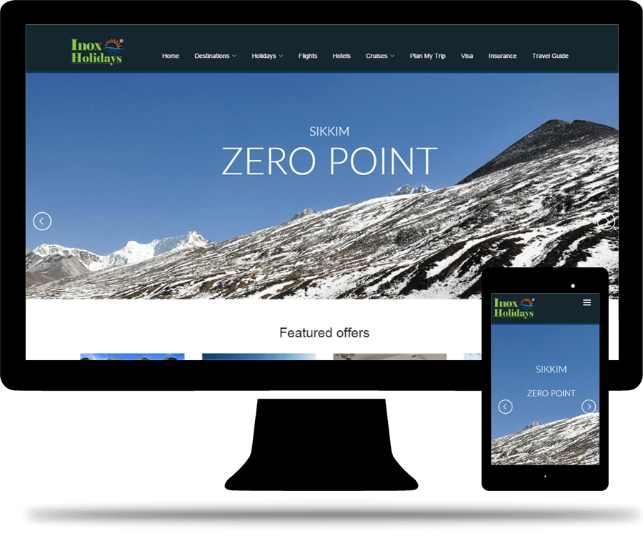
Inox Holidays
Inox Holidays provides world class, quality, and personal holiday service.
Our Work:
- Web Development
- Responsive Web Design
- Custome Web Design
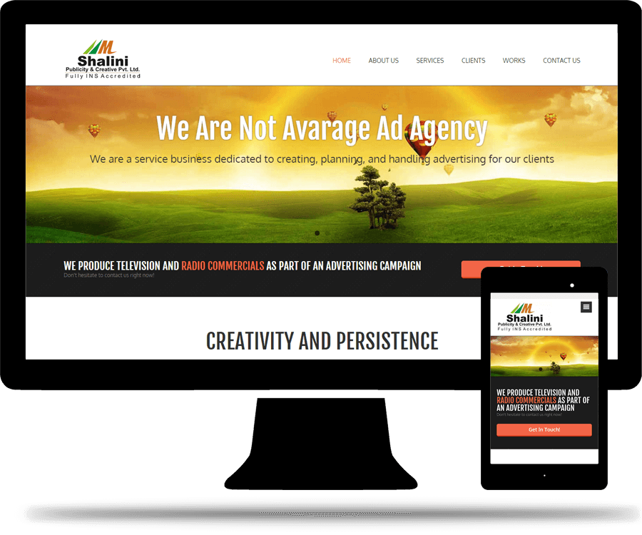
Shalini Publicity
Shalini Publicity & Creative Private Limited is a leading Advertising Agency that offers a 360 degree marketing and promotion strategy to a varied list of clients from Government & Non-Government Organizations , Corporates and NGOs.
Our Work:
- Responsive Web Design
- Custome Web Design
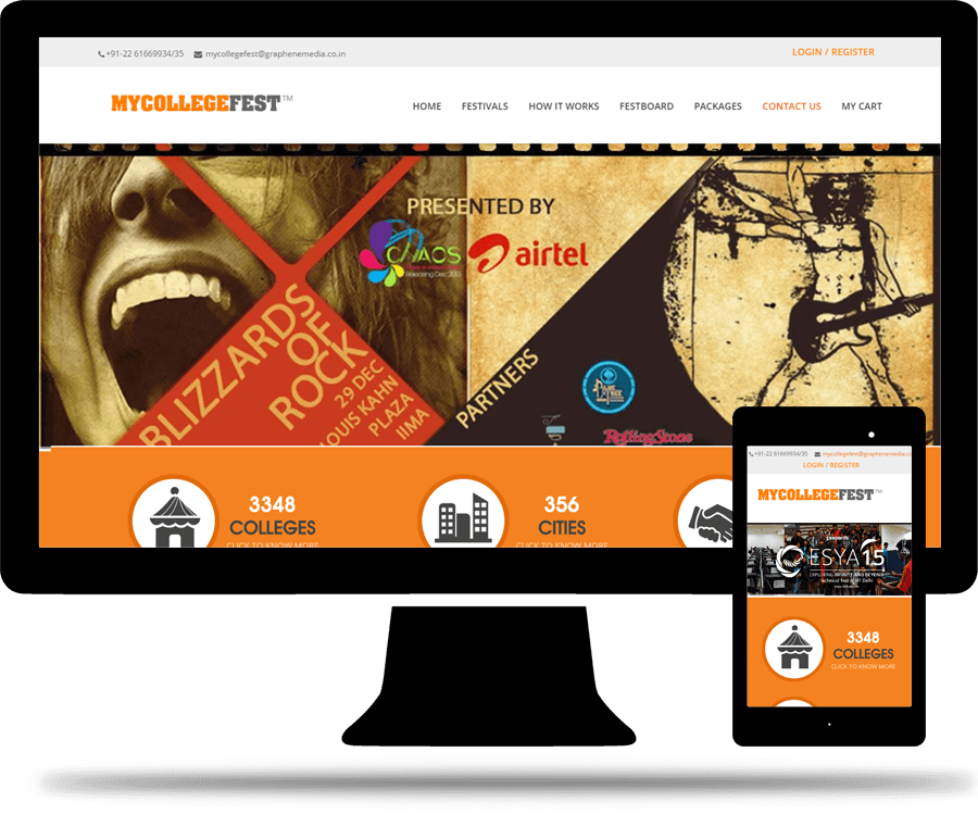
Mycollegefest
Mycollegefest is first of a kind platform which allows colleges & brands to connect across 300+cities pan india at a click of the button.
Our Work:
- Web Development
- Responsive Website Design
- Custome Web Design
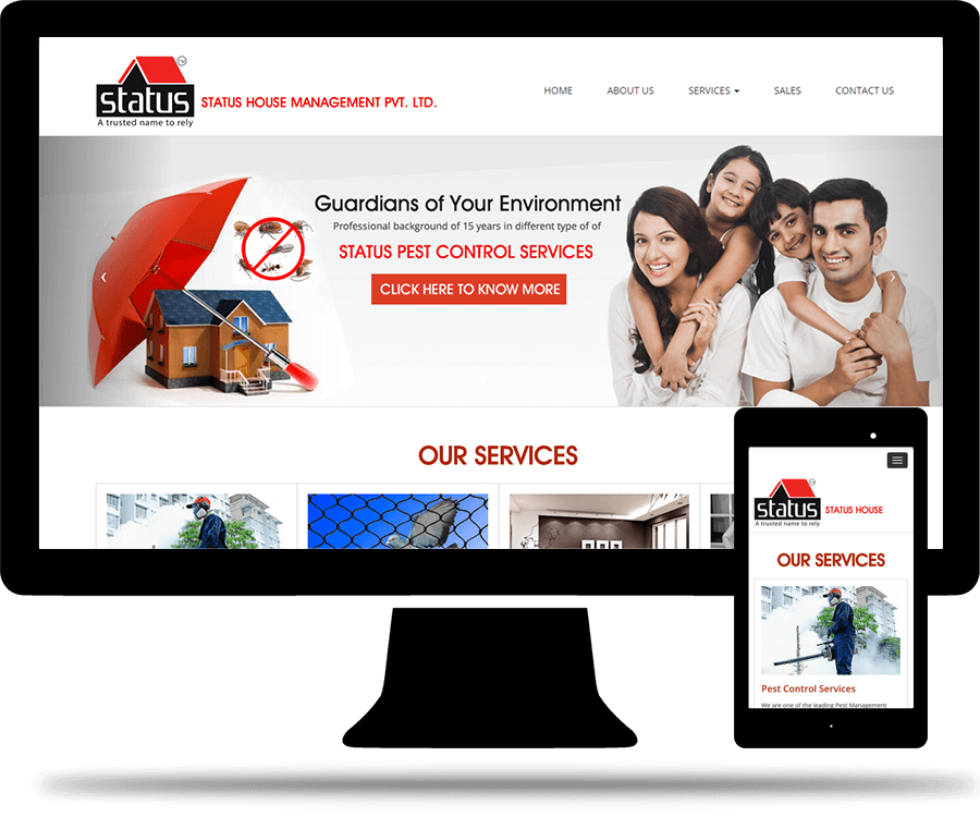
Status House Management
Status House Management is a premium service provider that provides Pest Control Services, Bird Netting Solutions, Interior Designer and House Keeping Services.
Our Work:
- Responsive Web Design
- Custome Web Design
- Logo Design
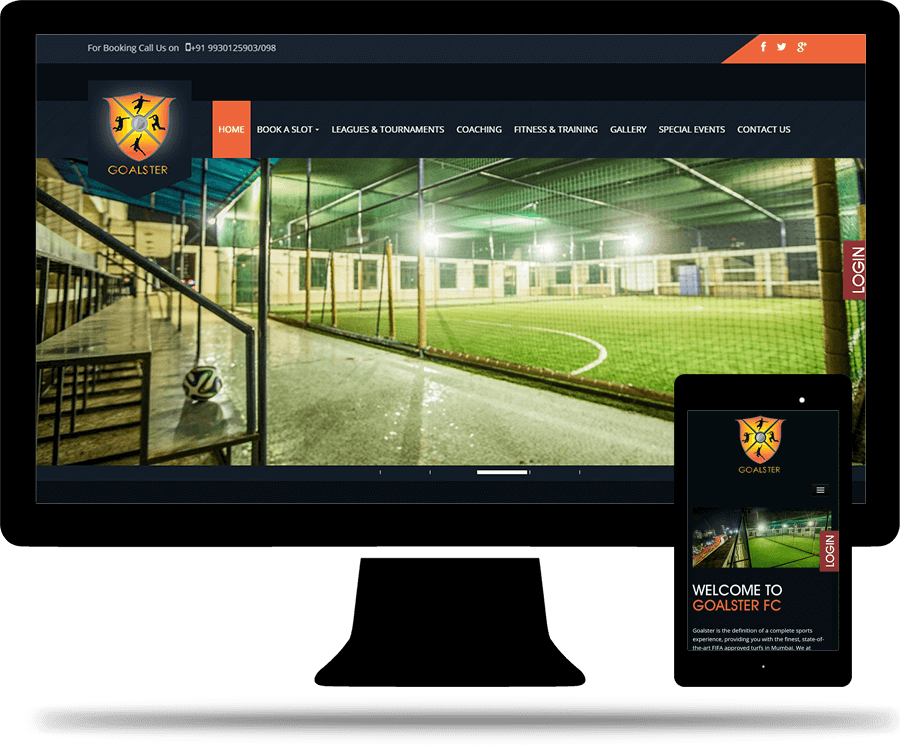
Goalster FC
Goalster is the definition of a complete sports experience, providing you with the finest, state-of-the-art FIFA approved turfs in Mumbai.
Our Work:
- Web Development
- Responsive Design
- Custome Web Design
- Logo Design
- Payment Gateway Integration